Branding
Branding
About Me
About me

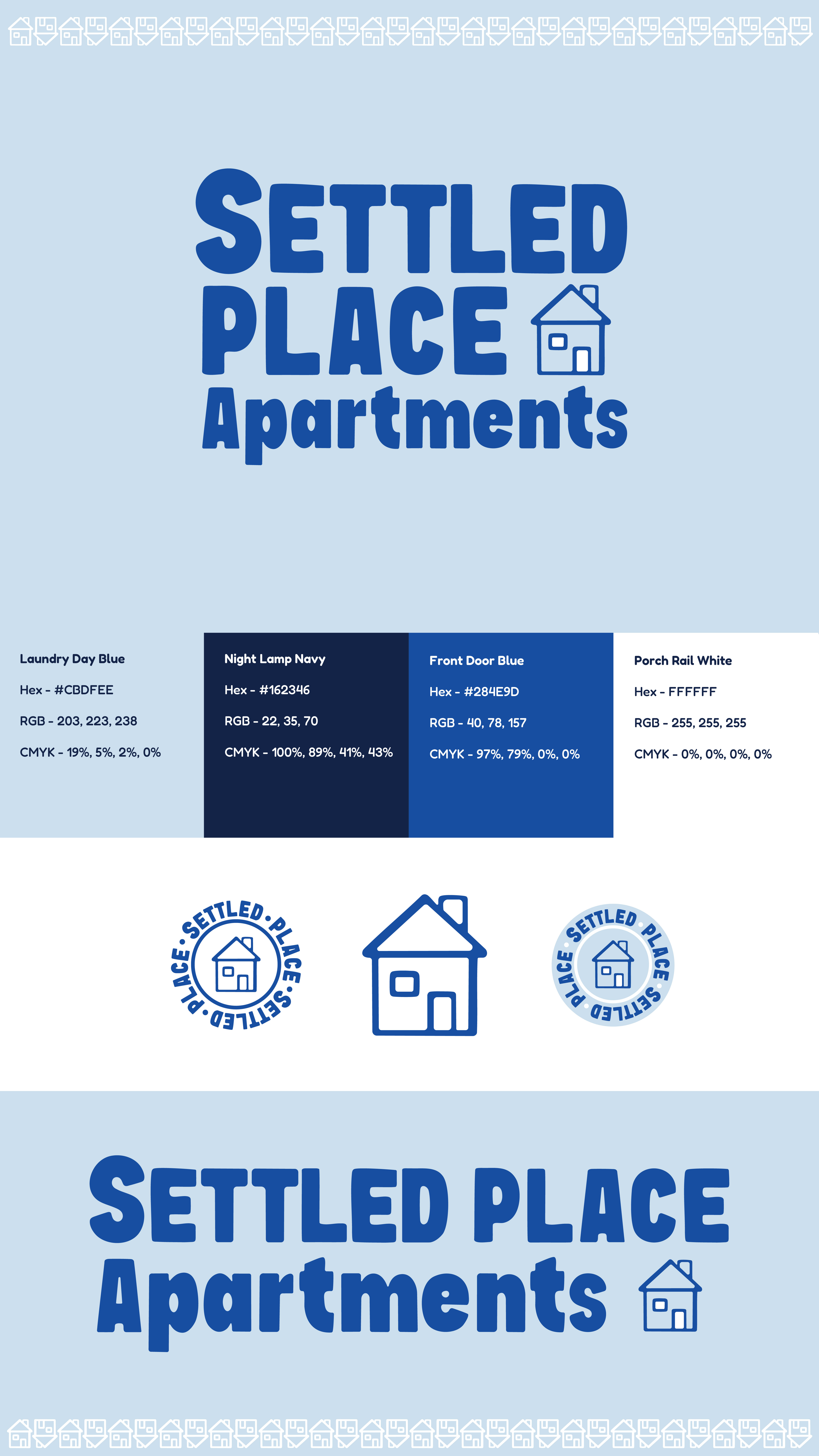
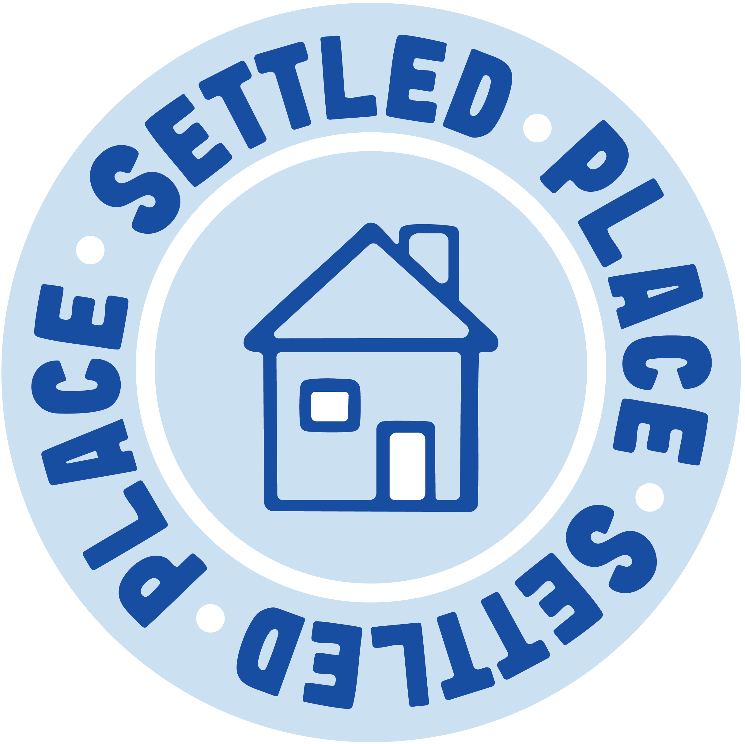
Settled Place Apartments is a branding project designed for an apartment company focused on comfort, trust, and community. The logo uses a simple and clean design to create a homey, welcoming feel that draws people in and makes the brand approachable. Light blue and royal blue were chosen to represent calmness, loyalty, and reliability, helping communicate a safe and inviting place to live.
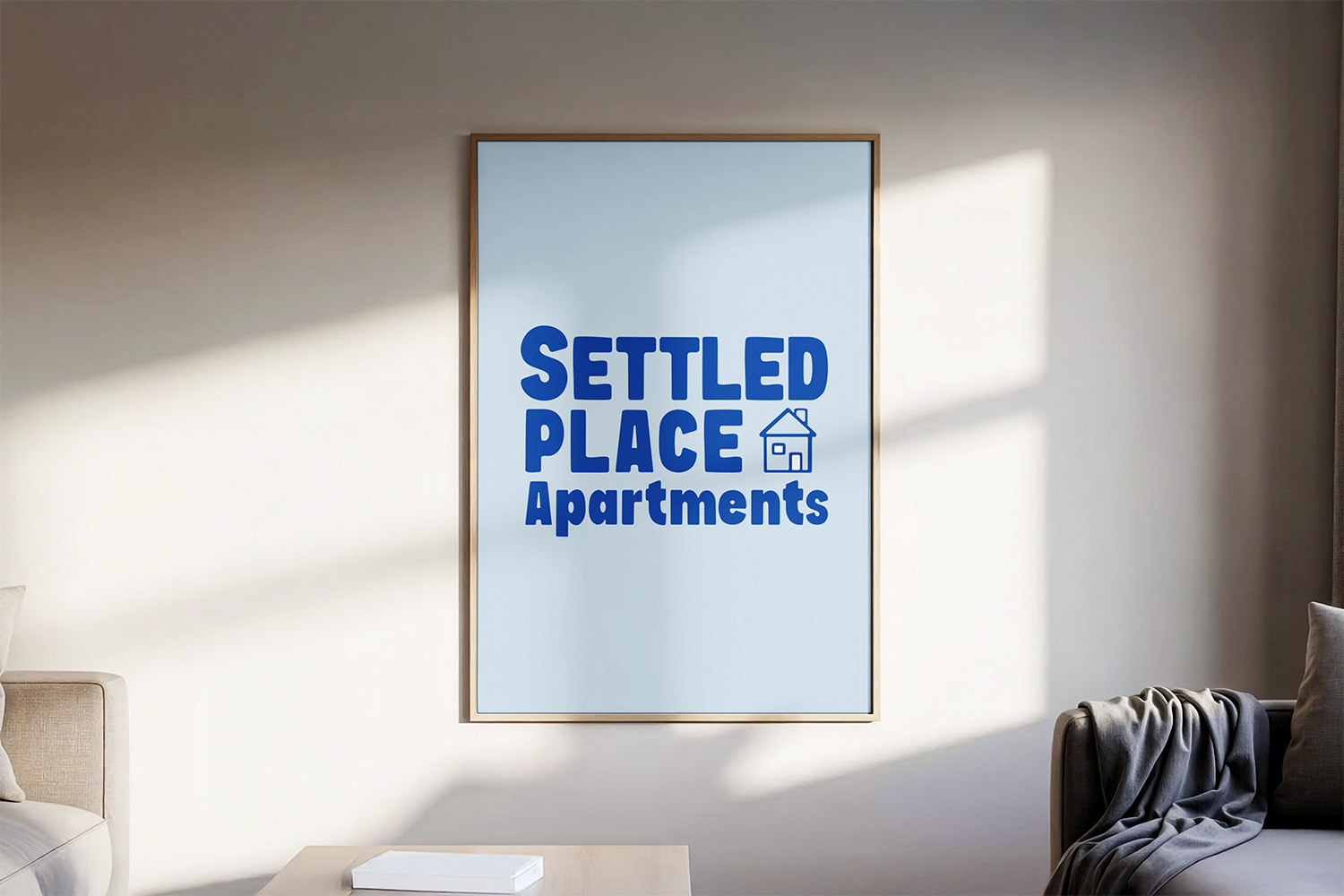
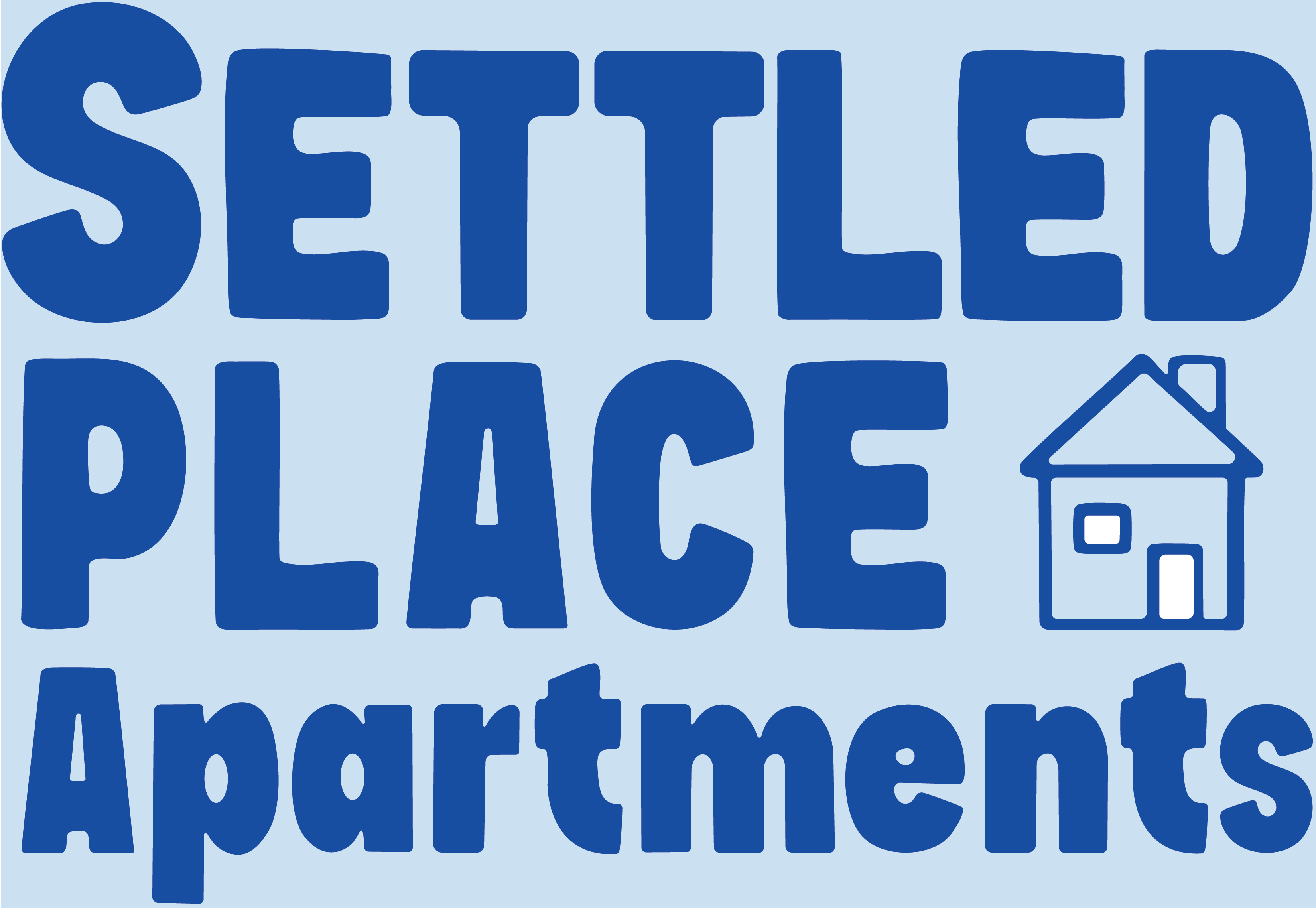
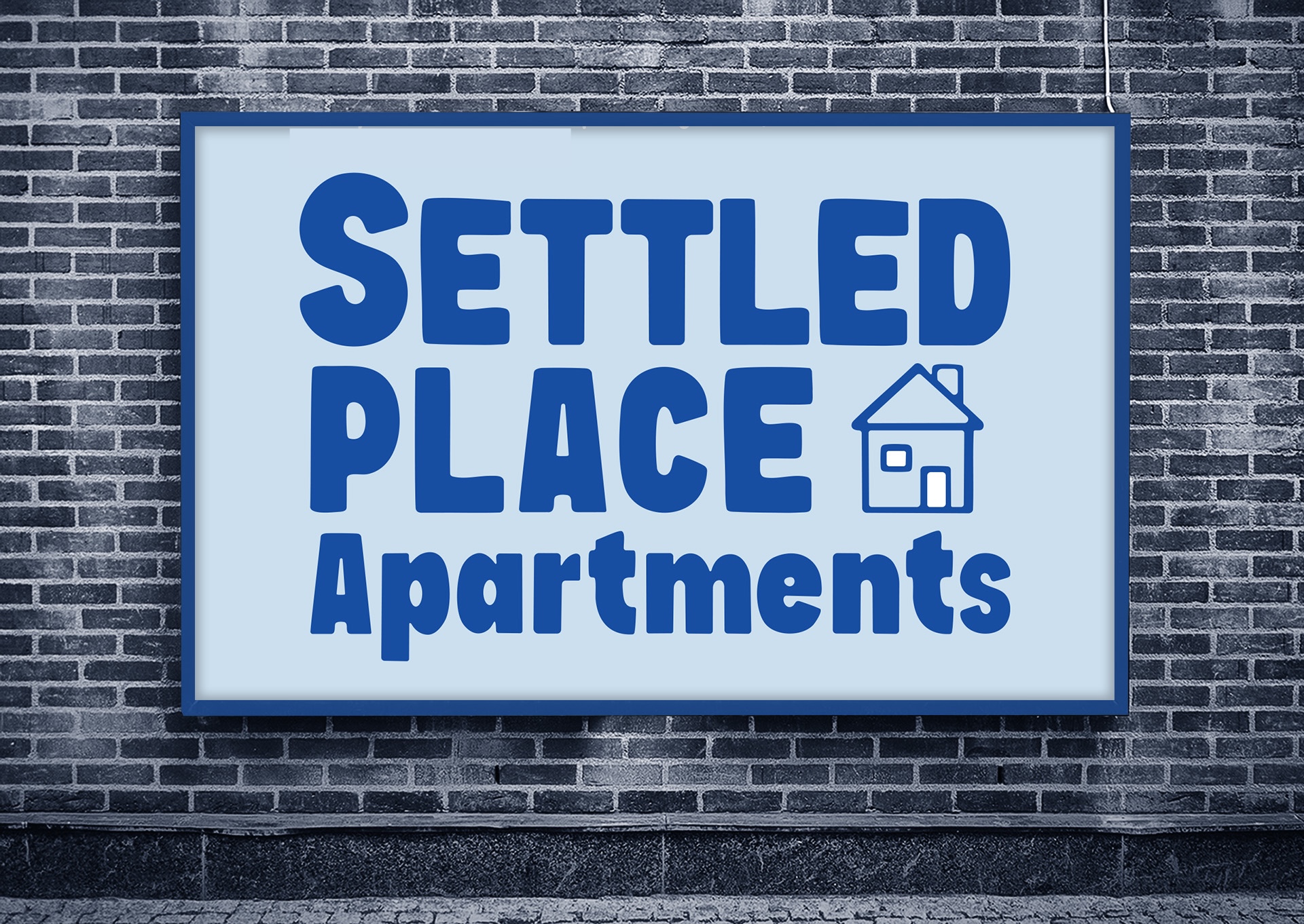
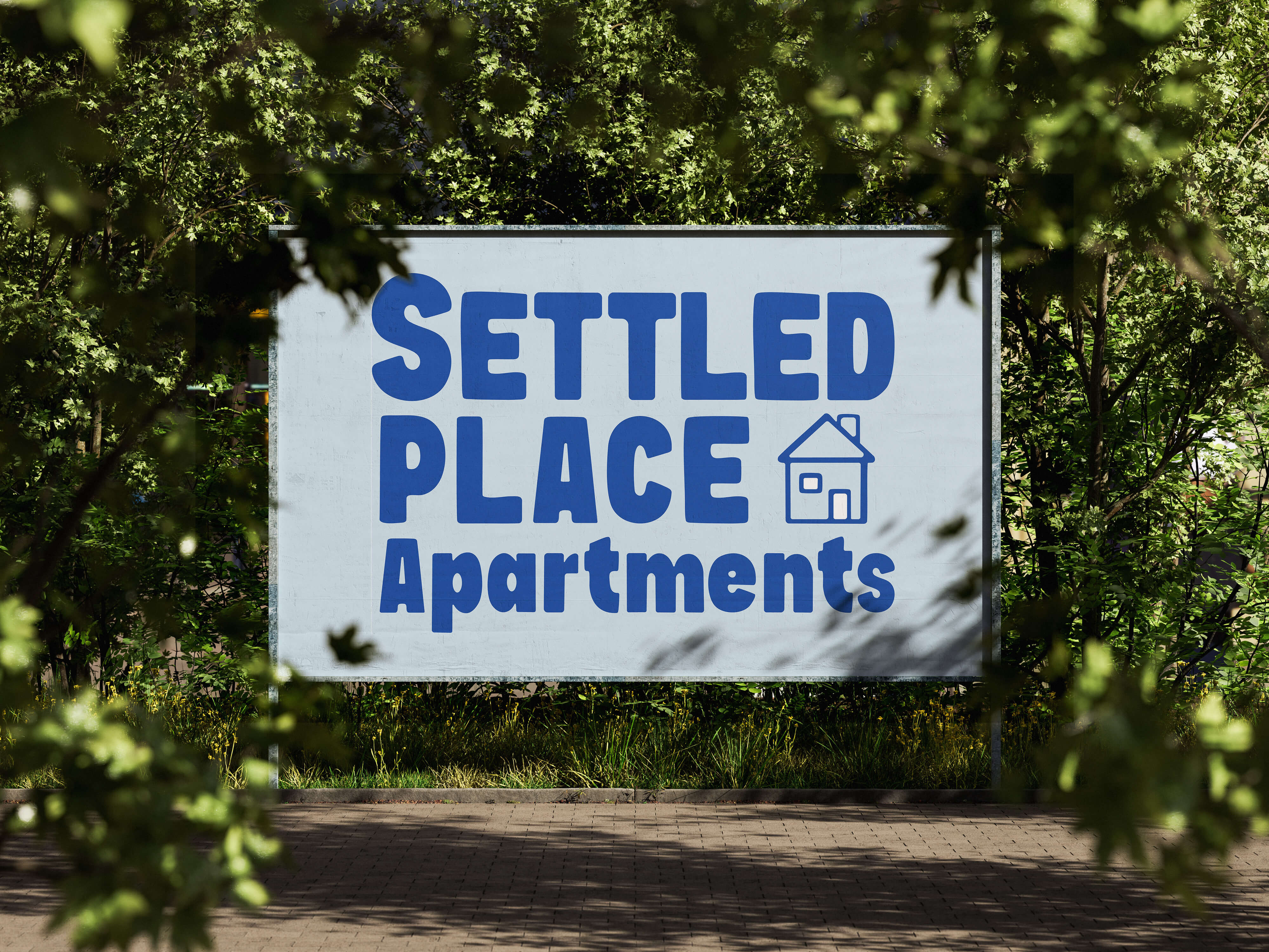
Main Logo
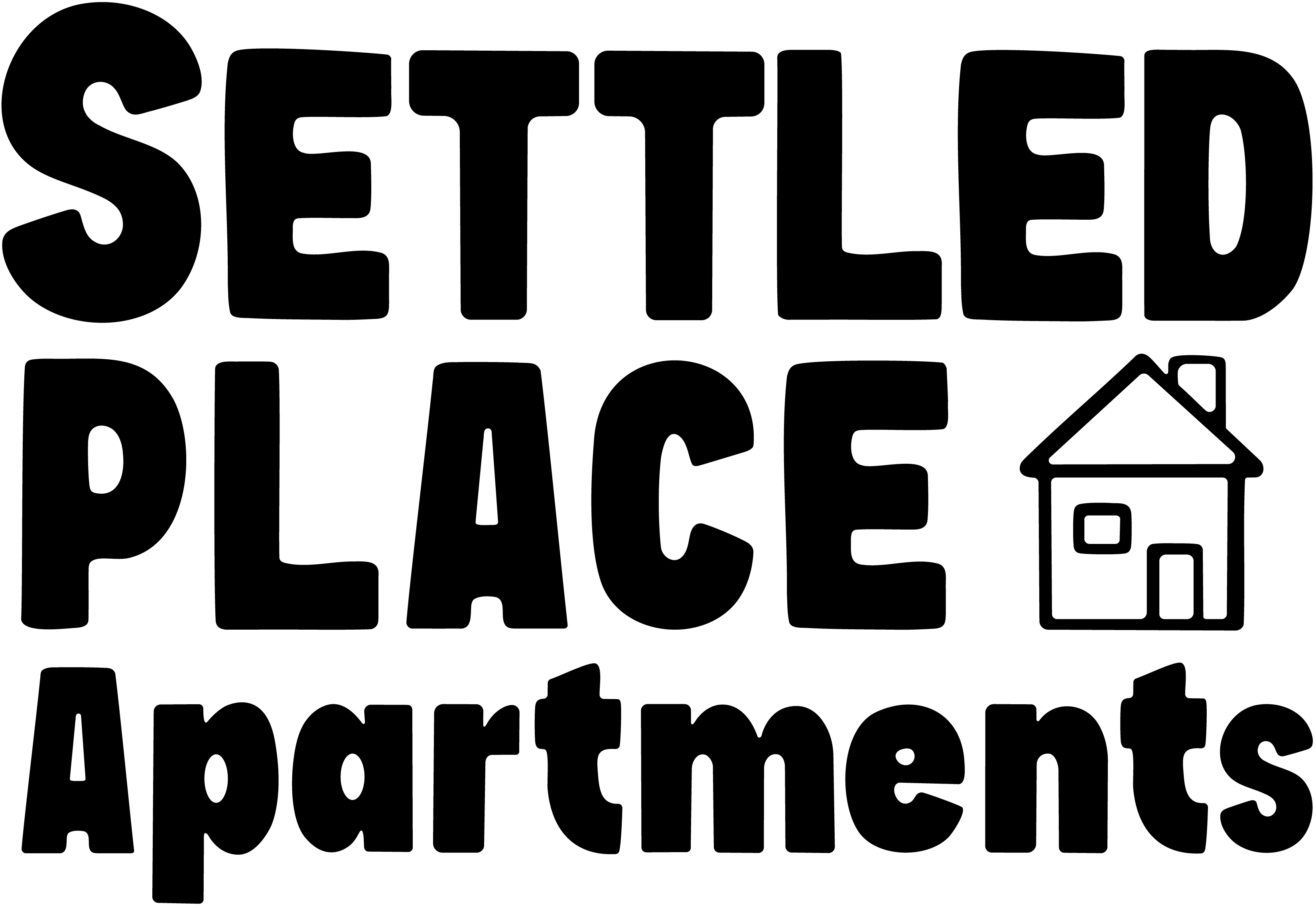

Black and White Version
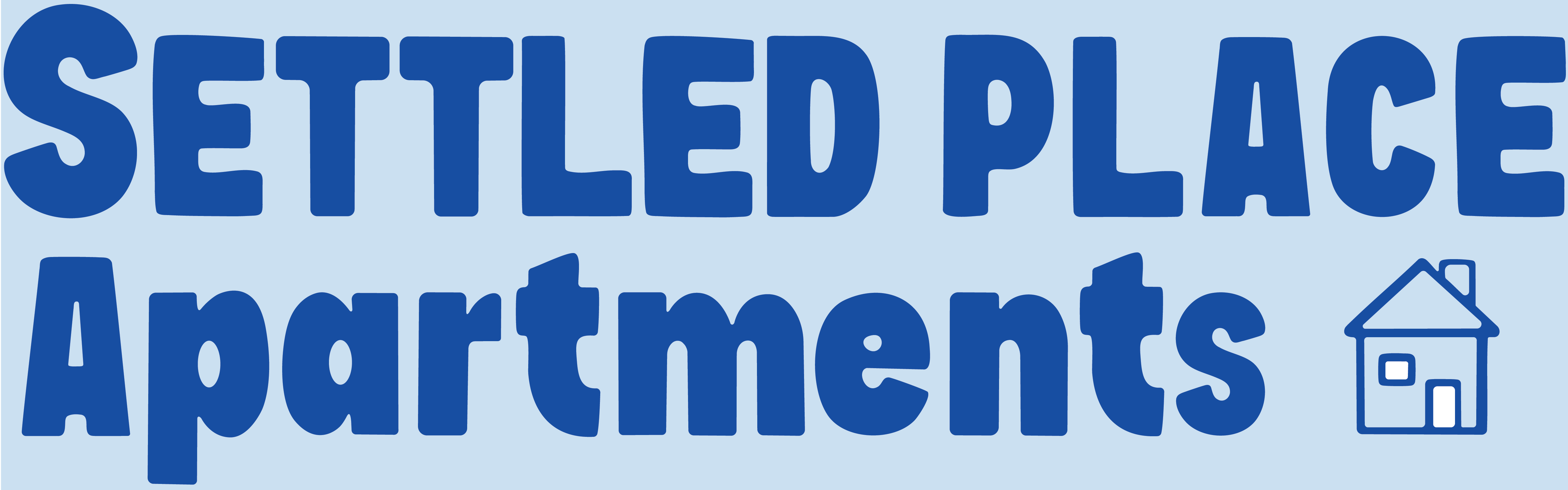
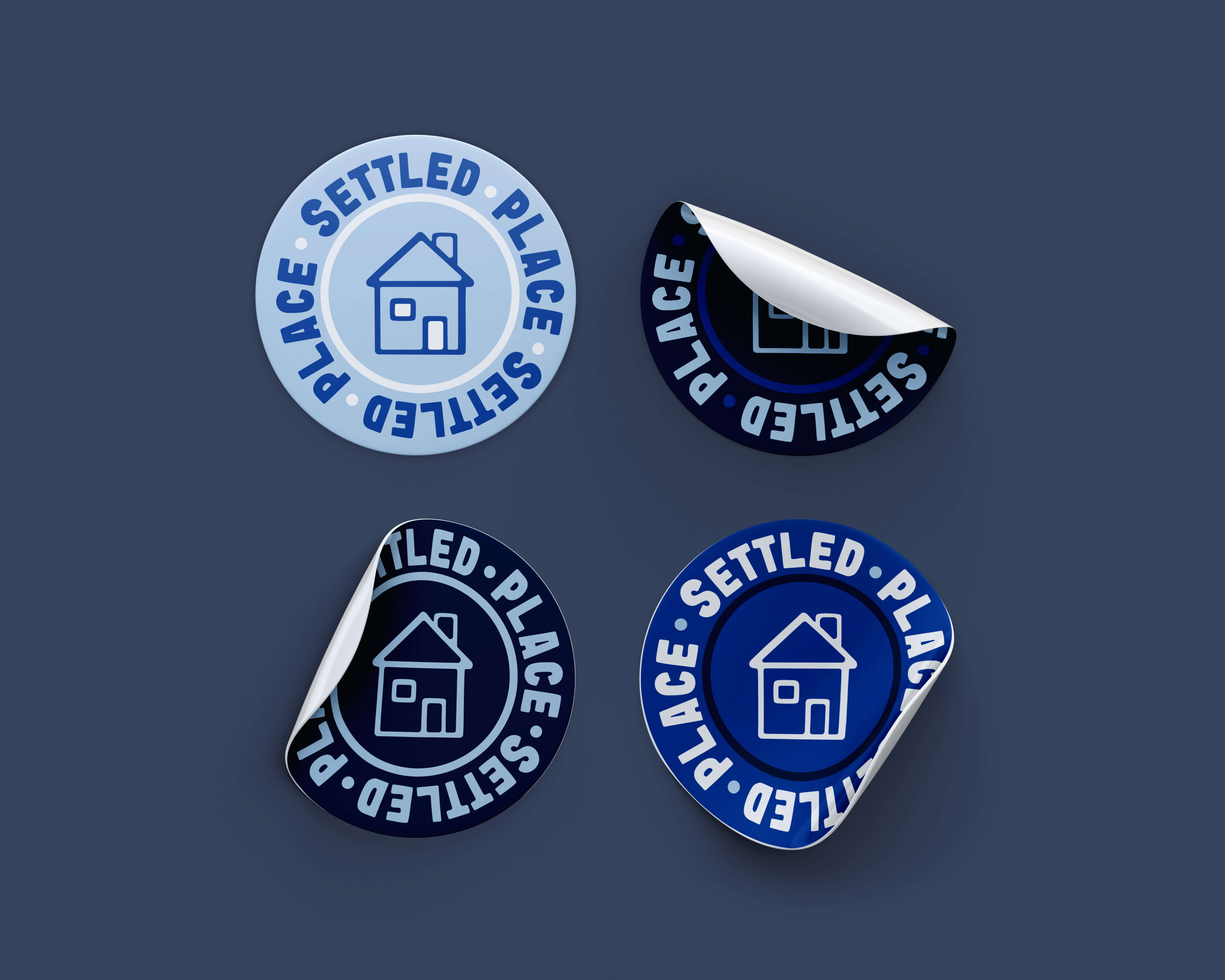
Alternate Marks