Portfolio
Portfolio
About Me
About me

May 2024
Art Director: Cassandra Reese
Institution: Pennwest University, Edinboro
Team credits: Sydney Oxenrider, Andrea Rhodes, Lindsey Beans-Polk, Liam Pearce,
Riley Francis and Avery Marshall
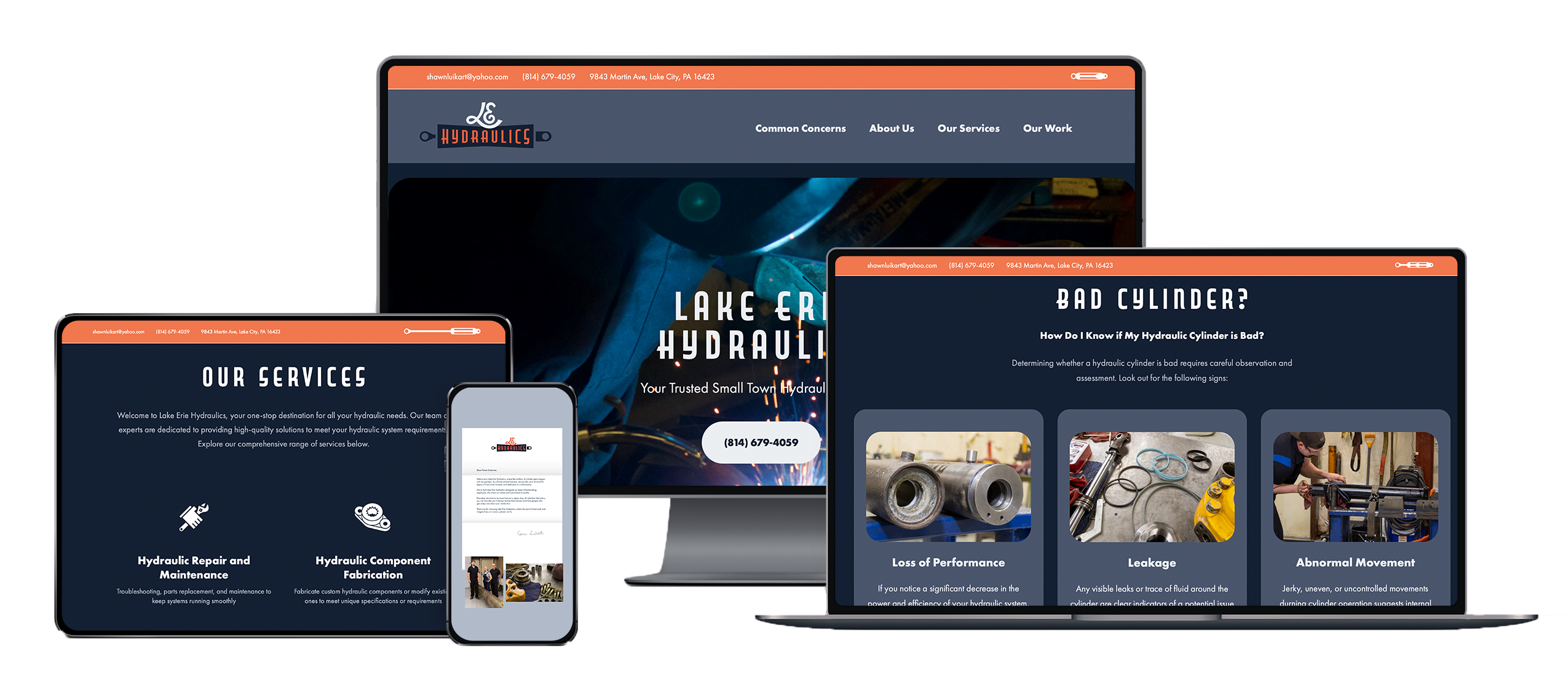
This single-page website, designed for Lake Erie Hydraulics, is built with clarity and accessibility at its core. The design reflects the company’s hardworking, blue-collar roots and family-oriented values, prioritizing straightforward navigation and essential information. With a simple structure and clear calls to action, the site allows customers to quickly understand their services, learn who they are, and easily get in touch—no friction, just function.
Click here to check out the websiteA thoughtful, accessible website designed for The Historical Institute of Culture and the African American Experience, showcasing the museum’s exhibitions, programs, and mission. The design highlights the depth and significance of the stories being preserved while providing clear pathways for visitors to explore offerings and plan their trip. With intuitive navigation and organized information, the site invites users to engage with history and experience the museum both digitally and in person.
Click here to check out the website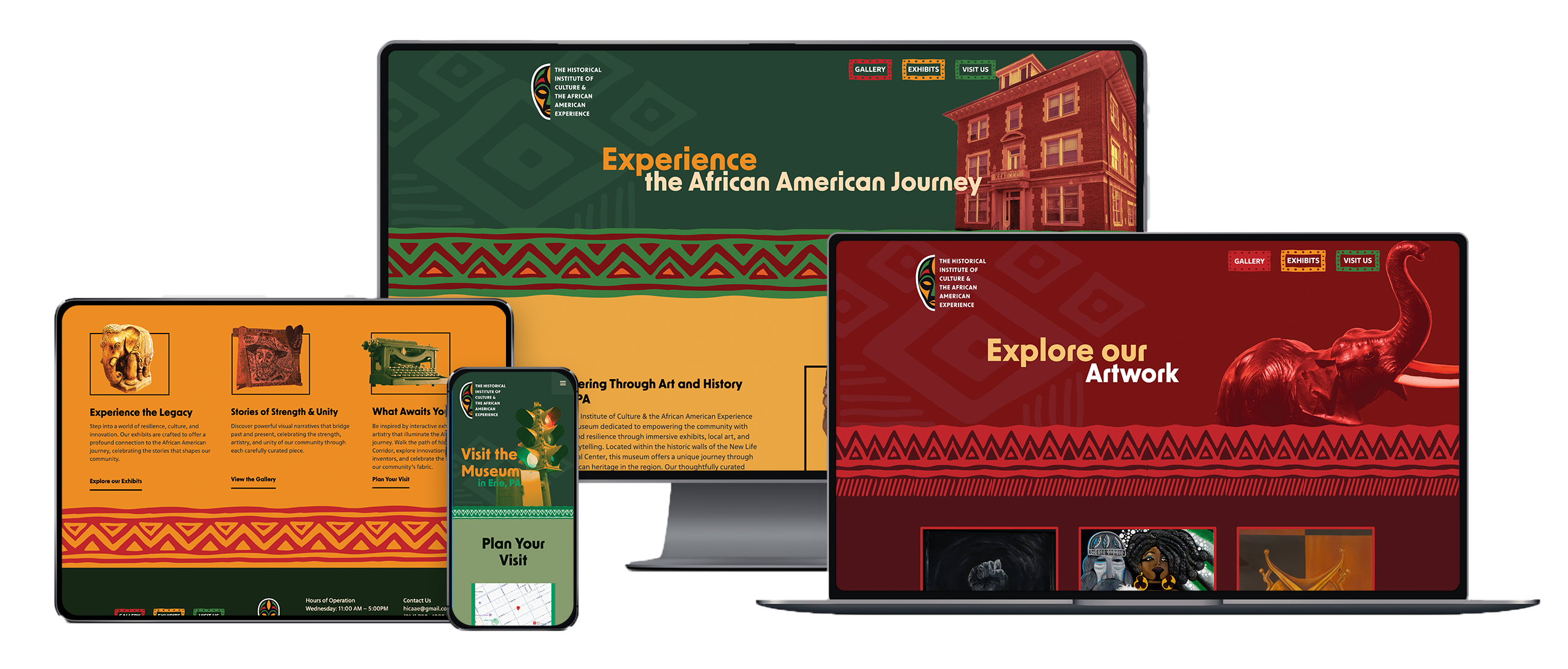
December 2024
Art Director: Cassandra Reese
Institution: Pennwest University, Edinboro
Team Credits: Madeline Lucroe, Becca Man, Lindsey Beans-polk,
Vince Iezzi, Riley Francis and Avery Marshall
August 2023
Client: Liberty Street Antiques from Franklin, PA
A warm, inviting website designed for Liberty Street Antiques, capturing the charm and character of a rustic mercantile. The design highlights the store’s curated selection, location details, and clear information for prospective vendors, creating an accessible experience for both shoppers and sellers. With an emphasis on authenticity and ease of navigation, the site reflects the timeless, community-driven spirit of the store.
Click here to check out the websiteThis infographic explains to the average person why recycling plastic water bottles is so important. The video also advises on how to recycle these water bottles, so the viewer has more information on how they can help the environment by recycling.


Motion, but make it wrong. These GIFs lean into the spirit of bad art by being awkward, choppy, and intentionally off. By rejecting the polish motion design is known for, they echo the Museum of Bad Art’s celebration of imperfection, bringing new life to familiar elements like the flower and brand phrases. By animating brand phrases and logo elements like the flower, the system expands in unexpected ways, proving that even “bad” can be intentional, expressive, and oddly compelling.
This motion transition focuses on control and clarity by using smooth, continuous movement paired with sharp line work to construct the Gem City Sports Podcast Network logo. The result is a visually engaging entry point that captures attention while reinforcing a polished, modern identity.
Team Credits: Roswell Butina, Garrett Conway, and Spencer Boesch
This two-minute timer explores motion through the lens of sport, drawing from the structure and flow of a track. Smooth, continuous movement and refined line work create a clean, engaging countdown that aligns with the Gem City Sports Podcast Network’s polished visual system.
Team Credits: Roswell Butina, Garrett Conway, and Spencer Boesch

